
In 2026, a car badge can make a familiar vehicle feel distinctive before the engine even starts. car emblems are small, but they carry a brand’s history, design language, and identity. Look closely at a hood badge in daylight: its edges, finish, and proportions can reveal more than a glossy advertisement. A strong emblem feels intentional. A weak one can look like an afterthought.
Industrial designer Dieter Rams offered a useful standard: “Good design is as little design as possible.” Rams was not an automotive emblem specialist, but his principle helps explain why clear shapes and restrained details often age well. It also raises a fair question: does a striking badge serve the car, or merely decorate it? There is no single answer.
This guide looks at the best Car Emblems in 2026 through design, materials, craftsmanship, and brand recognition. It considers classic symbols alongside newer, simplified marks, while noting how lighting and paint color can change an emblem’s appearance. Some judgments remain subjective. That is worth admitting. A badge admired on a showroom wall may feel less convincing after years of weather and washing. The sections ahead compare notable designs and explain what makes each one memorable, practical, or simply beautiful.
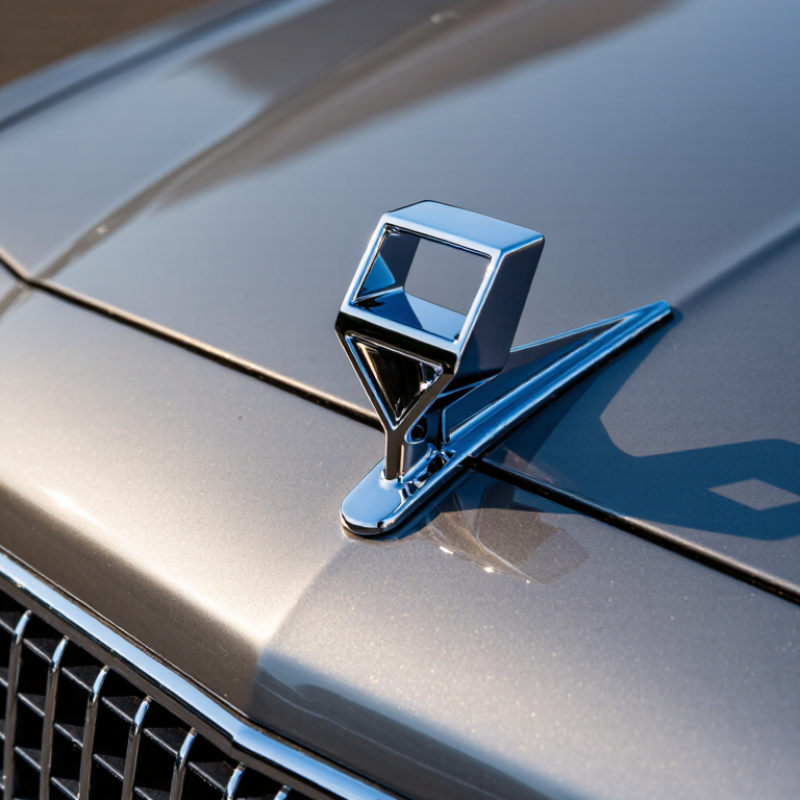
In 2026, a car emblem is designed as a small, high-visibility interface between a vehicle and its owner. Designers begin with its viewing distance, mounting surface, and lighting conditions. A shape that looks crisp on a screen may blur when reduced to a few centimeters. So teams test physical samples.
Materials matter. A raised metal finish can catch sunlight, while a matte surface may stay legible under harsh glare. Engineers also check how the emblem handles heat, rain, road dust, and routine washing. Adhesive strength and edge sealing affect whether it stays secure over time. These checks are practical, not glamorous.
Evaluation combines appearance with durability and readability. Reviewers may compare color consistency, inspect fine lines under magnification, and view samples from several angles. They can also test whether the emblem remains clear after repeated exposure to weather. Small details count. Still, scoring is not perfectly objective; personal taste can influence what looks balanced. A useful review records both measured results and the conditions behind them, rather than treating one attractive photograph as proof of quality.
The best car emblems in 2026 earn recognition before a driver reads a name. Clear silhouettes help: a raised shape, balanced spacing, and strong contrast remain visible on a dusty tailgate or in rain. Small details matter. A crisp edge can suggest care; a crowded design may blur at a distance. Yet polish alone is not meaning. An emblem feels memorable when its shape consistently signals qualities people associate with the vehicle.
Craft has measurable context, though no global report isolates emblem quality. WIPO’s World Intellectual Property Indicators 2024 recorded about 1.52 million industrial design applications worldwide in 2023, up 2.8% from 2022. That figure covers many industries, not car badges specifically. It does show how fiercely visual design competes for attention. Look closely at an emblem’s finish: Are its edges clean? Does it sit flush, without collecting dirt around its border? These small choices affect perceived quality.
Meaning is harder to measure. Deloitte’s 2024 Global Automotive Consumer Study surveyed more than 27,000 consumers across 26 countries, reflecting varied expectations rather than one universal taste. A meaningful emblem should work across cultures, materials, and viewing distances. I may overvalue restraint; a simple mark can also feel anonymous. The strongest designs balance quick recognition with a detail worth noticing up close.
A brand-neutral comparison of common automotive emblem design forms. Scores are editorial assessments of design characteristics, not results from a consumer survey.
| Emblem Design Form | Recognition | Craft and Construction | Common Meaning or Association | Design Strength | Potential Limitation | Overall Score |
|---|---|---|---|---|---|---|
| Shield | High: a strong outer contour remains easy to identify at a glance. | Works well with raised borders, layered finishes, and contrasting interior details. | Often associated with protection, heritage, or authority. | Combines a distinctive silhouette with room for an internal symbol. | Small internal details can become difficult to read at a distance. | 4.5 / 5 |
| Roundel | High: a circular outline is simple to recognize and reproduce. | Suitable for concentric rings, inset colors, and clean, symmetrical construction. | Can suggest unity, continuity, precision, or completeness. | Clear, balanced shape that adapts well to different vehicle sizes. | May look generic if its center lacks a distinctive feature. | 4.3 / 5 |
| Monogram or Letterform | High when the letter shape is distinctive; lower when strokes are too intricate. | Precision depends on clean edges, legible spacing, and consistent proportions. | Often communicates identity, continuity, or a founder-led history. | Compact and adaptable for grille, wheel, and interior applications. | Fine strokes may lose clarity when the emblem is very small. | 4.2 / 5 |
| Winged Form | High: the extended horizontal silhouette can stand out on a vehicle front or rear. | Layered or sculpted wings can create depth; thin projections require careful finishing. | Commonly evokes motion, freedom, speed, or aspiration. | Creates a strong sense of direction and visual movement. | Wide proportions can be harder to place on compact surfaces. | 4.1 / 5 |
| Animal Figure | High when the outline is bold and the pose is easy to distinguish. | Relief, polished contours, and painted details can give the figure a sculptural feel. | May suggest qualities associated with the chosen animal, such as strength or agility. | Memorable character and strong storytelling potential. | Detailed figures can become visually crowded or lose legibility at small sizes. | 4.0 / 5 |
| Star or Radial Symbol | Moderate to high: a simple star is quickly recognized, but the form is widely used. | Symmetry supports precise production and consistent alignment. | Can imply guidance, excellence, aspiration, or a point of origin. | Clear geometry that remains legible in small applications. | May need a distinctive frame or treatment to avoid a generic appearance. | 3.9 / 5 |
| Abstract Geometric Mark | Variable: recognition depends on a distinctive, consistently repeated silhouette. | Simple shapes can suit clean molded, stamped, or illuminated treatments. | Meaning is open-ended and can be shaped by the design and its context. | Offers a contemporary look and can work well across digital and physical surfaces. | May require repeated exposure before viewers associate it with a specific identity. | 3.8 / 5 |
Scoring basis: Editorial ratings consider silhouette recognition, visual adaptability, potential for material detail, and clarity of symbolic meaning. Automotive emblems commonly use materials such as plated metal and molded plastics; actual construction varies by design and application.
An emblem is a small object carrying a long visual memory. Its outline may echo an old radiator badge, a family crest, or a mechanical part once stamped by hand. A shield can suggest protection and endurance; a winged shape can imply movement without showing a vehicle. Small details matter. A raised rim catches light, while dark enamel makes fine lines easier to read from across a parking lot. These choices turn heritage into something tangible, not merely a date printed in a brochure.
S&P Global Mobility reported that the average age of light vehicles in the United States reached 12.6 years in 2024. That long ownership life gives an emblem repeated chances to become familiar, through daily commutes, repairs, and changing generations of drivers. A durable badge can preserve a visual link even as body shapes evolve. But heritage is not automatically good design. Too many historical flourishes can make an emblem feel crowded or dated. The strongest designs usually keep one recognizable cue, then simplify its edges, spacing, and materials for modern production. That balance is imperfect by nature: simplify too much, and the story disappears.
A car emblem now does more than identify a vehicle. It shapes the first impression and must endure sun, rain, road grit, and repeated washing. In 2026, material choice matters as much as the design itself. Molded polymers can create crisp, lightweight shapes, while metal finishes offer a cooler, more substantial feel. Neither option is automatically better. Surface coatings, edge quality, and resistance to fading often matter more than the material’s name.
Lighting is changing emblems from static badges into subtle visual features. Carefully diffused LEDs can create an even glow, while clear or translucent layers help soften bright points. A well-designed emblem should remain legible in daylight and restrained at night. Small details matter. Look for consistent illumination, sealed edges, and a finish that does not trap dirt around the light source. These details can affect both appearance and upkeep.
The best emblem balances visibility with durability and easy cleaning. A bright badge may look striking in a showroom, yet harsh reflections can reduce clarity outdoors. More parts can also mean more places for moisture or grime to collect. That trade-off deserves attention. When comparing designs, inspect them under different lighting and from several angles. A slight mismatch in color or brightness may seem minor, but it can make the whole front end feel less considered. My own preference is for quiet lighting and tactile materials, though that may not suit every vehicle.
How material choice shapes lightweight and illuminated emblem designs
Typical material density varies by grade. Lower-density polymers can help keep an emblem lightweight, while transparent plastics can suit illuminated designs. Density alone does not determine durability or overall quality.
In 2026, the best car emblems balance clear design with materials that can handle daily exposure. Look for crisp edges, even coloring, and lettering that remains readable from a few steps away. Small details matter. A raised surface should feel consistent, not sharp or uneven, and the backing should sit flush against the vehicle. A beautiful emblem that lifts at the corners is not a good choice.
Weather resistance is another practical measure. Sunlight can fade finishes, while rain, road grime, and repeated washing test both the surface and its attachment. Check whether the emblem is designed for exterior use and whether its installation instructions explain surface preparation. Clean, dry paint helps adhesive hold. Still, even strong adhesive cannot correct poor alignment or a badly matched shape.
Fit and restraint often distinguish a polished emblem from a distracting one. Compare its dimensions with the available space, and consider how its colors work with the vehicle’s paint. I’d be cautious about choosing a finish based only on a product photo; reflections can make colors look different in person. That judgment is imperfect, of course. A simple emblem may suit one vehicle, while another calls for more contrast, but legibility and secure mounting should remain nonnegotiable.